Many redesign projects begin with a mood board: colors, fonts, a new homepage look. The structure underneath, meaning which pages exist, how they are grouped and what they are called, often gets carried over from the old site with a few tweaks. The result is a website that looks new but still leaves visitors hunting for the one thing they came for.
Planning that structure first is called information architecture. It is less glamorous than visual design, but it decides whether people find your services, prices and contact options. Below are seven mistakes we see often, and how to avoid each one.
What information architecture covers
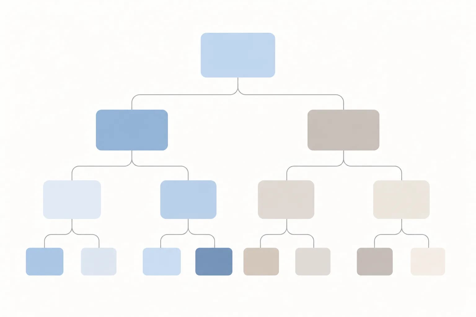
In plain terms, it answers four questions: what content does the site need, how is that content grouped, what are the groups and pages called, and how do people move between them. It shows up in your main menu, your footer, your page URLs, your internal links and your search results page.
It is not a design layer. You can sketch it on paper or in a spreadsheet before anyone opens a design tool, which is exactly why it is worth doing first. Changing a box on a sketch costs minutes. Changing a menu after pages are designed, built and filled with content costs much more.
Seven mistakes to avoid
1. Designing before auditing what you already have
If you do not know what is on your current site, you cannot decide what the new one needs. Teams often discover mid-project that there are old promo pages, duplicate service descriptions or pages nobody remembers publishing.
How to avoid it: list every page in a simple spreadsheet. For each one, note its purpose, whether it still gets visits or is linked from elsewhere, and make a decision: keep, rewrite, merge or remove. This also gives you the raw material for a safe move later. If your URLs will change, our website migration checklist covers how to protect your search traffic.
2. Organizing the menu around your company, not your visitor
Menus often mirror the org chart: one section per department or product line. Visitors do not know or care how your company is divided. They arrive with a task, such as comparing options, checking whether you serve their area, or getting a quote.
How to avoid it: write down the five to eight most common things a visitor wants to do, then check that each has an obvious route from the homepage. For example, a clinic with separate departments might find that patients really want to book a visit, check doctors' schedules and see what insurance is accepted. Those tasks should shape the menu, not the department list.
3. Using internal jargon as labels
Terms like Solutions, Offerings, Resources or a product code name feel natural inside the company and mean little outside it. A vague label forces visitors to click and guess.
How to avoid it: use the words customers use. Read customer emails, WhatsApp questions and sales call notes, and borrow their phrasing. If you serve both Indonesian and English speakers, decide deliberately which language each label uses rather than mixing them by accident. A label should tell people what they will find before they click.
4. Putting everything in the main menu
The fear of hiding something important leads to menus with a dozen or more items and long dropdowns. When everything is prominent, nothing is, and on a phone the menu becomes a scrolling list.
How to avoid it: rank pages by how much they matter to your visitors and your business. Keep the top level short, and move secondary pages such as policies, careers or archives into the footer. Each menu item should earn its place. A page can still exist without being in the main navigation.
A good site structure mirrors how visitors think about their problem, not how your company is organized. Decide the pages, groups and labels before you decide the look.
5. Burying depth where people will not look
The opposite problem is a neat-looking menu hiding five levels of pages. Important content, such as pricing information or a specific service, ends up four clicks from the homepage and is only reachable if you already know where it is.
How to avoid it: aim for a shallow structure where key pages are reachable in a couple of clicks. Link related pages to each other inside the content, for instance from a service page to a relevant case explanation or inquiry page. If you are unsure how people should reach you, see our comparison of WhatsApp, contact forms and booking widgets, then make sure that path is visible from every key page.
6. Skipping a test of the structure
Teams usually approve a sitemap by agreeing with it in a meeting. People inside the company already know where everything is, so the structure always looks logical to them.
How to avoid it: test it with a handful of people who are not on the project. Show a simple outline, with no design, and ask where they would click to do a specific task, such as finding delivery information or asking for a quote. Watch where they hesitate. If several people go to the wrong place for the same task, the label or grouping needs work. Fixing it at this stage is cheap.
7. Treating the structure as finished at launch
A site structure that was sensible at launch drifts as new services, campaigns and articles are added. Without an owner, pages pile up in whatever spot was convenient at the time.
How to avoid it: write a short set of rules: where new service pages go, how articles are categorized, who approves a new menu item. Review the structure periodically, and check which pages visitors search for on your site, since search terms reveal what they cannot find. This kind of routine fits naturally into the ongoing care we describe in our guide to hosting and maintaining your website.
Takeaways you can act on this month
- Build a page inventory before any design work and mark each page keep, rewrite, merge or remove.
- List the top visitor tasks and check that each has a clear route from the homepage.
- Replace internal terms with the words customers actually use.
- Keep the main menu short and move secondary pages to the footer.
- Test a plain outline with five or so outsiders before approving the sitemap.
- Assign someone to own the structure after launch.
If you want a second pair of eyes on this stage, it is a core part of our UI/UX design work, where structure comes before visual design.
A redesign works best when the plan for what goes where is settled before colors and layouts are chosen. If you are weighing a redesign and want to talk through your site structure, you are welcome to get in touch with the Digital Revo team.
Frequently asked questions
How is information architecture different from a sitemap?
A sitemap is one output of the process: a diagram or list of pages and how they connect. Information architecture is the thinking behind it, including what content is needed, how it is grouped, how it is labeled and how people navigate between pages.
Do we need this if we are only refreshing the visual design?
Not always a full exercise, but a quick review is still worthwhile. If visitors already find things easily and your menu matches their tasks, you may only need small adjustments. If people often ask you questions that the site should answer, the structure is likely part of the problem.
Who should be involved in planning the structure?
Include someone who talks to customers daily, such as sales or customer service, along with whoever owns the website and a decision-maker. Customer-facing staff know the real questions and wording. Then test the result with a few people outside the company, since insiders tend to overestimate how obvious the structure is.