Someone who clicks "Request a quote" or "Book a consultation" has already decided to talk to you. The form is the last thing standing between that decision and a real conversation. Many businesses lose inquiries here, and not because the offer was weak. The form felt long, asked for odd information, broke on a phone, or left the visitor unsure what would happen next.
This is a checklist you can work through on your own website, form by form. It is written for business owners and managers, so you can check most items yourself and hand the technical ones to whoever maintains your site.
1. Be clear about what the form is for
A form that tries to serve every purpose usually serves none well. Before touching any fields, answer these questions:
- Can you say in one sentence what happens after someone submits? For example, "Our team replies on WhatsApp the same working day." If you cannot, the visitor cannot guess it either.
- Is there one form per goal? A quote request, a job application and a support question need different information. Mixing them produces a long, confusing form.
- Is a form the right tool at all? For some businesses, a WhatsApp button gets more conversations than a form does. Our article on choosing between WhatsApp, a contact form or a booking widget helps you decide.
- Does a specific person own the replies? A form nobody checks is worse than no form.
2. Cut fields to what you need
Every field costs the visitor a little effort, and effort adds up on a small screen. A useful test for each field: if this were blank, could we still reply helpfully? If yes, the field is a candidate for removal or for being optional.
- Start from the minimum: a name, one way to reach the person, and what they need.
- Move qualifying questions such as budget, timeline or company size into the follow-up conversation. A renovation contractor, for example, may want to know the property size, but can ask on the first call instead of making a stranger type it at the start.
- Ask for one contact method, or let the visitor choose, rather than requiring phone, email and address together.
- Do not force account creation before an inquiry or a simple booking.
- Mark the few optional fields as "optional" instead of marking every required field with an asterisk.
- Keep "How did you hear about us?" only if someone actually uses the answer, and make it optional.
Details that matter for Indonesian audiences
- Names: many people have a single name. Use one "Full name" field instead of separate required first and last name fields that reject them.
- Phone numbers: people type 0812..., +62 812..., or 62812..., sometimes with spaces or dashes. Accept all of these and clean them up in the background rather than showing an error.
- WhatsApp versus email: if your team will reply on WhatsApp, ask for the WhatsApp number and say so. Asking for an email you will not use adds friction for no benefit.
- Addresses: only ask when you need to deliver or visit. Local addresses often include RT/RW, kelurahan and kecamatan, which rigid foreign-style fields handle badly. A city or province selector plus one free-text address field is often easier.
Every field on a form is a small cost for the visitor. Keep only the questions you truly need answered before the first reply, and ask the rest in conversation.
3. Make layout and labels easy to follow
- Use a single column. Side-by-side fields are easy to misread and awkward on phones.
- Put labels above the fields and keep them visible. Placeholder text that disappears as soon as someone types is not a label, and people forget what was asked.
- Use the words your customers use. "What do you need help with?" is clearer than "Inquiry type."
- Group related fields and leave enough space between groups to scan.
- Add helper text only where people hesitate, such as a note beside the phone field explaining it is used for replies only.
- Write a specific button label. "Send my request" tells people what happens; "Submit" does not. See our microcopy checklist for buttons, errors and empty screens for more on wording.
- Use one clear primary button and skip the "Reset" or "Clear" button, which only causes accidents.
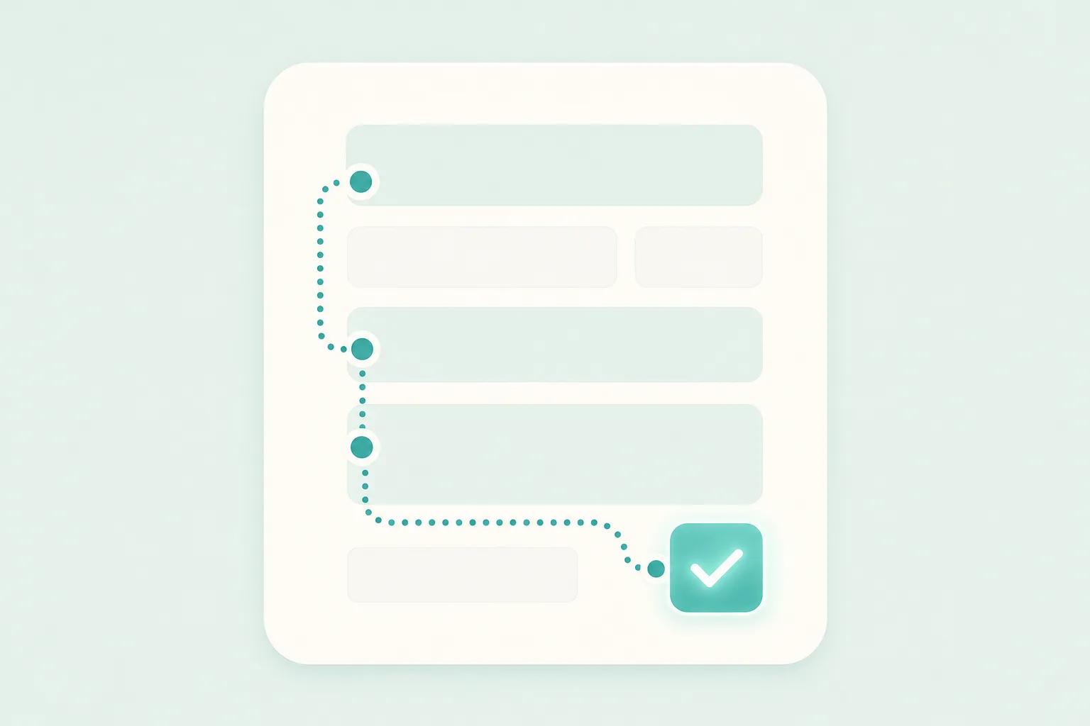
- Split only truly long forms into steps, with a visible indicator of progress. A short form is better kept on one page.
4. Test it as a phone user
For many visitors, the phone is the only screen they use, so the form has to work there first.
- Check the keyboard. Phone fields should open a number pad, email fields an email keyboard. Ask your developer to set the correct input types.
- Check tap targets. Buttons and checkboxes should be big enough for a thumb and spaced so people do not hit the wrong one.
- Allow autofill so the browser can fill in names and numbers.
- Replace long dropdowns with buttons or radio options when there are only a few choices.
- Open the keyboard and look again. Make sure the submit button and the error messages are not hidden behind it or a sticky banner.
- Try a mid-range phone on a slow connection, not only the newest device on office Wi-Fi. Heavy pages and scripts delay the form; our plain-language guide to Core Web Vitals explains why.
- Be careful with CAPTCHAs. Picture puzzles are frustrating on a phone. Quieter spam protection, which your developer can set up, is usually kinder to real visitors.
5. Handle errors kindly
Mistakes will happen, and how you handle them decides whether someone tries again or leaves.
- Check a field after the person leaves it, not while they are still typing.
- Show the message beside the field, not only in a banner at the top.
- Say what to do. "Please enter a phone number we can reach, for example 0812 3456 7890" helps more than "Invalid input."
- Never clear what the person already typed. Losing a long message is a quick way to lose an inquiry.
- Do not rely on color alone. Red borders mean nothing to some users, so add text and an icon.
- Move focus to the first problem field after a failed submit so people do not hunt for it.
- Avoid blaming language. "We could not read that number" lands better than "You entered a wrong number."
6. Design what happens after "Send"
- Show a clear confirmation on screen that says the message arrived and what happens next. Only promise a reply time your team can actually keep.
- Send an automatic acknowledgement by email or WhatsApp where it makes sense, so the visitor has proof.
- Check that submissions really arrive. Send yourself a test every month. Notifications that land in spam or in the inbox of a former employee are a common and silent failure.
- Provide a fallback. If sending fails, show another way to reach you instead of a dead end.
- Reply promptly. The best-designed form cannot make up for days of silence.
7. Test with real people and measure
- Fill in your own form on a phone as if you were a stranger who knows nothing about your company.
- Ask three to five people outside your team to try it without help while you watch quietly. Note where they hesitate or ask a question out loud.
- If your analytics allow it, compare how many people start the form with how many finish. A gap means something is wrong, and if you can see which field people stop at, start there.
- Change one thing at a time so you know which change helped.
- Review the form every few months and remove fields that your team never uses.
Takeaways
- Define one purpose per form and say plainly what happens after submitting.
- Keep only the fields you need for a useful first reply, and ask the rest later.
- Accept the formats Indonesian users actually type for names and phone numbers.
- Use single-column layouts, visible labels and specific button text.
- Test on a real phone with the keyboard open, and make errors specific and forgiving.
- Confirm that submissions arrive and that someone replies quickly.
A good form feels like the first polite step of a conversation, not paperwork. If you would like a second opinion on yours, or help redesigning it as part of a wider website project, you are welcome to get in touch with the Digital Revo team through our UI/UX design service.
Frequently asked questions
How many fields should a contact form have?
There is no magic number. Ask only for what you need to send a useful first reply. For many service businesses that means a name, one contact method and a short message. Anything beyond that should earn its place.
Should I split a long form into multiple steps?
Only if the form is genuinely long, such as a detailed quote request. Steps with a visible progress indicator can make a long form feel manageable. For a short form, a single page is faster and simpler.
Is a WhatsApp button enough instead of a form?
It can be, especially if your customers already prefer chatting. But some visitors want to write a longer message, attach details or avoid sharing their number in a chat. Many businesses offer both, and the choice depends on how your team handles replies.