
Many business websites are designed on a large desktop monitor, approved in a meeting room on a laptop, and then quietly judged by customers on a mid-range phone, on a mobile connection, with one thumb, while doing something else. The design looks fine to the people who made it and frustrating to the people it is meant to win.
Mobile-first design reverses that order. You design for the small screen and the harder conditions first, then let the layout grow for larger screens. This guide walks through the steps we would follow for an Indonesian audience, where phone-based browsing, chat-based contact and varied connection quality shape how people actually use a site.
Step 1: Find out how your visitors really arrive
Do not assume. Before changing any design, open your analytics and look at three things:
- Device split: what share of visitors use phones, tablets and desktops.
- Entry points: do people arrive from Google search, Instagram, a WhatsApp link, a marketplace profile or a printed QR code?
- Where they leave: which pages lose phone visitors fastest.
If you have no analytics yet, ask your sales or customer service team how customers first contact them and what device they seem to be using. Even this informal answer tells you whether mobile-first is a nice idea or the main event. For most consumer-facing and local service businesses, it is the main event, but check your own numbers rather than taking that on faith.
Step 2: Test on the phones your customers actually own
A designer's flagship phone on office Wi-Fi is the best possible case. Your customers may have an older or mid-range Android phone, limited storage, a cracked screen and a connection that swings between strong and weak depending on where they are.
Keep a few real devices for testing, including at least one mid-range Android phone. Then try these checks:
- Load your homepage on mobile data, not Wi-Fi, and note how long it takes before you can read and tap something.
- Scroll the page quickly and see whether it stutters.
- Use the site outdoors or at lower screen brightness to check that text is still readable.
Speed on phones is a design decision as much as a technical one. Large hero images, auto-playing video, carousels and stacked animation all cost time. Our explainer on Core Web Vitals in plain terms covers how to read the speed and stability scores that reflect this experience.
Step 3: Rebuild the first screen around one job
On a phone, the first screen is most of what a visitor sees before deciding to stay. It has room for very little, so it must answer three questions quickly:
- What do you offer?
- Is it for me, and is it available where I am?
- What do I do next?
Write a plain headline that names the service or product, add one supporting line, and place one clear primary action beneath it. Resist the urge to fit a slideshow, a promotion banner, a cookie notice and a chat widget into the same space. If three things compete for the first screen, the visitor often picks none of them.
Cut, then order
List everything on your current homepage, then sort it into what a first-time phone visitor needs now, what they need later, and what only your team cares about. The last group usually goes. The middle group moves lower down or to its own page.
Step 4: Design for thumbs, not cursors
A finger is much less precise than a mouse pointer. Most of the problems here are small and easy to fix once you look for them:
- Tap targets: buttons and links should be large enough to hit without zooming, with space between them so neighbouring links are not triggered by accident.
- Placement: important actions work best within comfortable thumb reach, and a sticky contact or order button at the bottom of the screen is often better than one tucked into the header.
- Navigation: keep the menu short. A long nested menu that works on desktop becomes a maze on a phone.
- Text size: body text should be readable without pinching. Short paragraphs and clear headings help people scan while on the move.
Avoid features that depend on hovering, since a phone has no hover. Information hidden behind a hover tooltip is simply invisible to a touch user.
Step 5: Make chat a first-class way to get in touch
For many Indonesian customers, sending a WhatsApp message feels easier and safer than filling in a form or writing an email. Treat that as a design input, not an afterthought.
- Offer WhatsApp beside, not instead of, other options. Some people prefer a call, a form or an email, so show the choices clearly.
- Prefill the message. A button that opens a chat with a short starter such as the product or service name saves the visitor typing and tells your team what the enquiry is about.
- Show what happens next. A line like your usual response hours sets expectations and reduces the feeling of sending a message into a void.
- Check the receiving end. Make sure someone owns the inbox, and that messages from the website are distinguishable from other chats.
Tip: Add a different prefilled message to each WhatsApp button, for example one for a product page and another for a pricing page, so your team immediately knows which page the enquiry came from.
If you plan to connect chat, payment methods or other services to your site, our step-by-step planning guide to payments, WhatsApp and APIs covers what to decide before building.
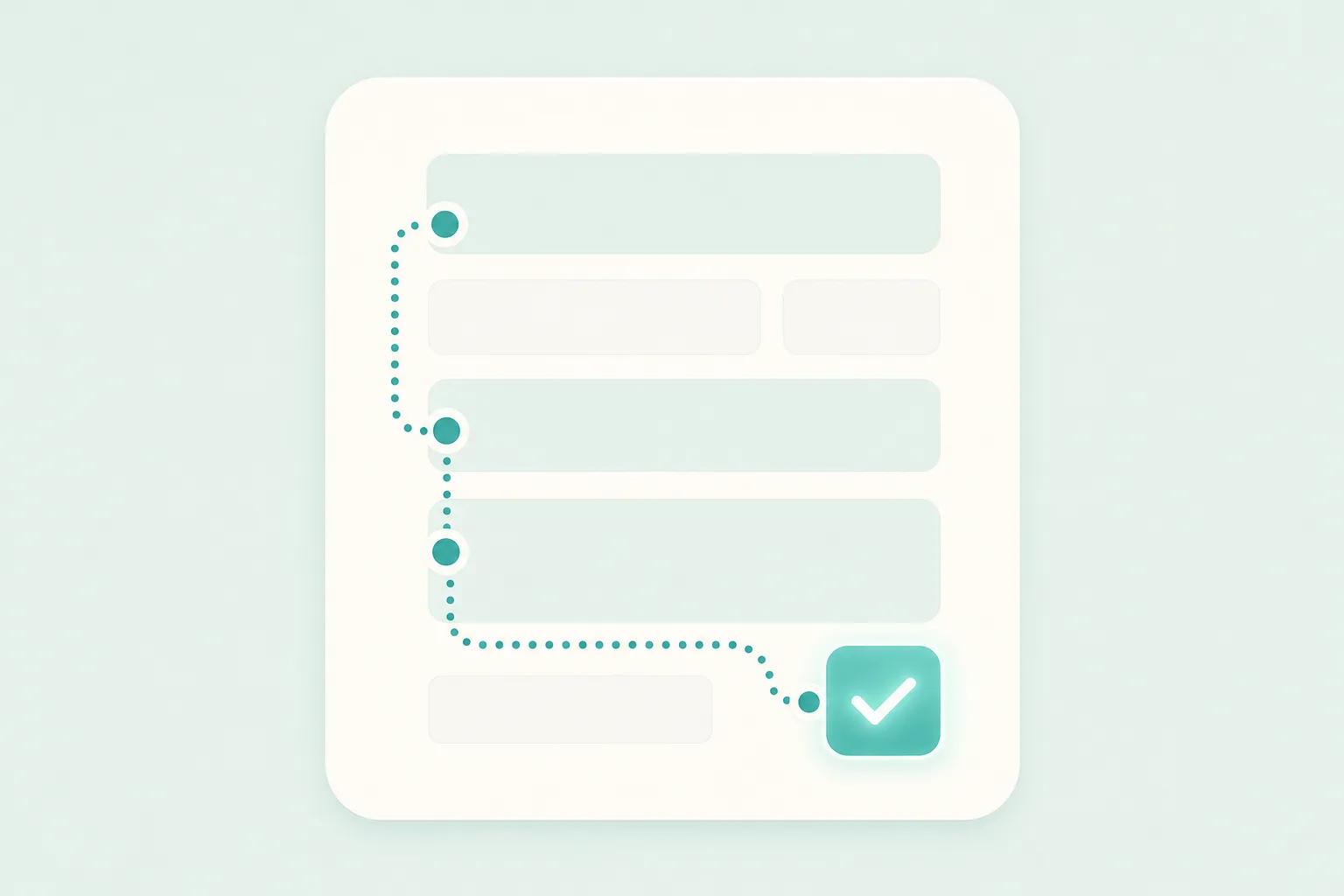
Step 6: Shorten every form and the path to payment
Typing on a phone is slow, and mistakes are easy. Wherever you still need a form, ask only for what you genuinely need to reply. Use the right keyboard for each field, such as a numeric keypad for phone numbers, and allow autofill. Name the problem clearly when something goes wrong, and keep what the person already typed.
If your site takes orders or payments, think through the local habits of your customers. Offer the payment methods they already trust, such as bank transfer, e-wallets or virtual accounts where they fit your business, and show prices in Rupiah with any extra charges visible early. Surprise costs at the last step are a common reason people abandon a purchase.
Step 7: Write for local readers
Mobile-first design is not only layout. Language and tone matter just as much on a small screen where there is little room to explain.
- Decide your primary language based on your customers. If you serve both Indonesian and international audiences, give visitors an obvious way to switch and make sure both versions are complete, not a half-translated copy.
- Use everyday words. Stiff, overly formal phrasing or unexplained jargon makes a page harder to read at a glance.
- Show trust signals that matter locally: a real address or service area, working hours, a visible phone number and real photos of your work or premises.
Step 8: Review, release and keep checking
Once the changes are live, do not treat the work as finished. Run through your main journey on a real phone yourself: arrive from a search result, find the service, and contact the business. Ask a colleague or a friendly customer who was not involved in the project to do the same while you watch where they hesitate.
Then check analytics again after a few weeks. Look at whether phone visitors reach the contact action more often, where they still leave, and what customers say in chats. Fix the biggest friction first and repeat.
Takeaways
- Start with your own data on devices and entry points rather than assumptions.
- Test on real mid-range phones and mobile data, not only on office Wi-Fi.
- Give the first screen one job and one clear action.
- Size and place controls for thumbs, and drop anything that needs hovering.
- Treat WhatsApp as a main contact route, with prefilled messages and a clear owner for replies.
- Keep forms short and payments familiar, with costs shown early.
- Write in the language and tone your customers actually use, then keep reviewing after launch.
Designing for the phone first usually makes the desktop version simpler and clearer as well, because every element has to earn its place.
Frequently asked questions
Does mobile-first mean the desktop site gets less attention?
No. It means you start with the most constrained experience and add to it for larger screens. Desktop visitors still matter, especially for business-to-business sites where people research on a computer, so the layout should use the extra space well. The difference is that the core content and actions are already proven on the small screen.
Is a separate mobile app better than a mobile-friendly website?
For most businesses that want enquiries, bookings or simple sales, a well-designed website is the better first step. People are not always willing to download an app for a business they have just discovered. An app can make sense later for frequent, repeat use such as a loyalty programme or a service customers use daily, but it is a larger commitment and should be justified by that repeat behaviour.
How do I know if my current site is failing on phones?
Open it on a real mid-range phone over mobile data and try to complete the main task, such as contacting you or placing an order. Notice slow loading, tiny buttons, sideways scrolling and hard-to-read text. Then compare phone and desktop behaviour in your analytics. If phone visitors leave far more often or rarely reach your contact action, the mobile experience is a likely cause.
If you would like a second pair of eyes on how your site feels on a phone, the Digital Revo team is happy to talk it through whenever you are ready.